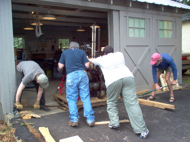
My first casting session provided mixed results. On one hand, I am ecstatic that I finally made a solid piece of type in my own shop; but, on the other, that same casting session left me somewhat overwhelmed, in particular because the type that I cast did not match the copy that I typed in my first take at the keyboard.
After a good six hours at the machine I had decent type bodies and the machine was running smoothly, but character output was seemingly random! Wrong characters on this scale must be a product of a mismatch of Monotype keybars, keybanks, or stop bars. Perhaps a combination. One thing is clear from the notes that came with the Times New Roman: the mat case layout has ‘evolved’ over its lifetime!
The type I was hoping to compose and cast was Times New Roman, from English matrices at 0.030 drive for American (Lanston) composition machines. Naturally, I had forgotten about the fact that these were 30 thousandths drive, so I cast with a English Constant Height mould. You know what that means, right? It means type that is 0.898 inches height-to-paper, a full 0.020 inches below the standard of 0.918 inches for American and British types. Oops.
With so many complications, it seems wise to attempt something simpler, in hopes of finding a shorter route to sucess. I’ve decided, for my next project, to simplify considerably and cast display type. The type is 14-point Bold Antique, Lanston Monotype #144, a face drawn for ATF in 1904 by Morris Fuller Benton.1 I wanted to cast 14pt because it is the smallest size of display type and with that fact certain concerns associated with casting larger sizes are alleviated. 18pt and 24pt are probably the easiest for me to handle physically—not at all fiddly like smaller types, and you can still hold several words of the type between your thumb and forefinger—but those sizes are a little more intimidating to cast. Bold Antique, as the name indicates, is a very bold, slab serif face. It lacks most of the subtlety, modulation and fine detail you find in a typeface like Centaur, and for this reason, it should pose fewer problems in casting than would a face with sinewy extremities.
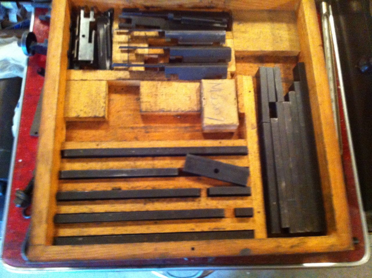
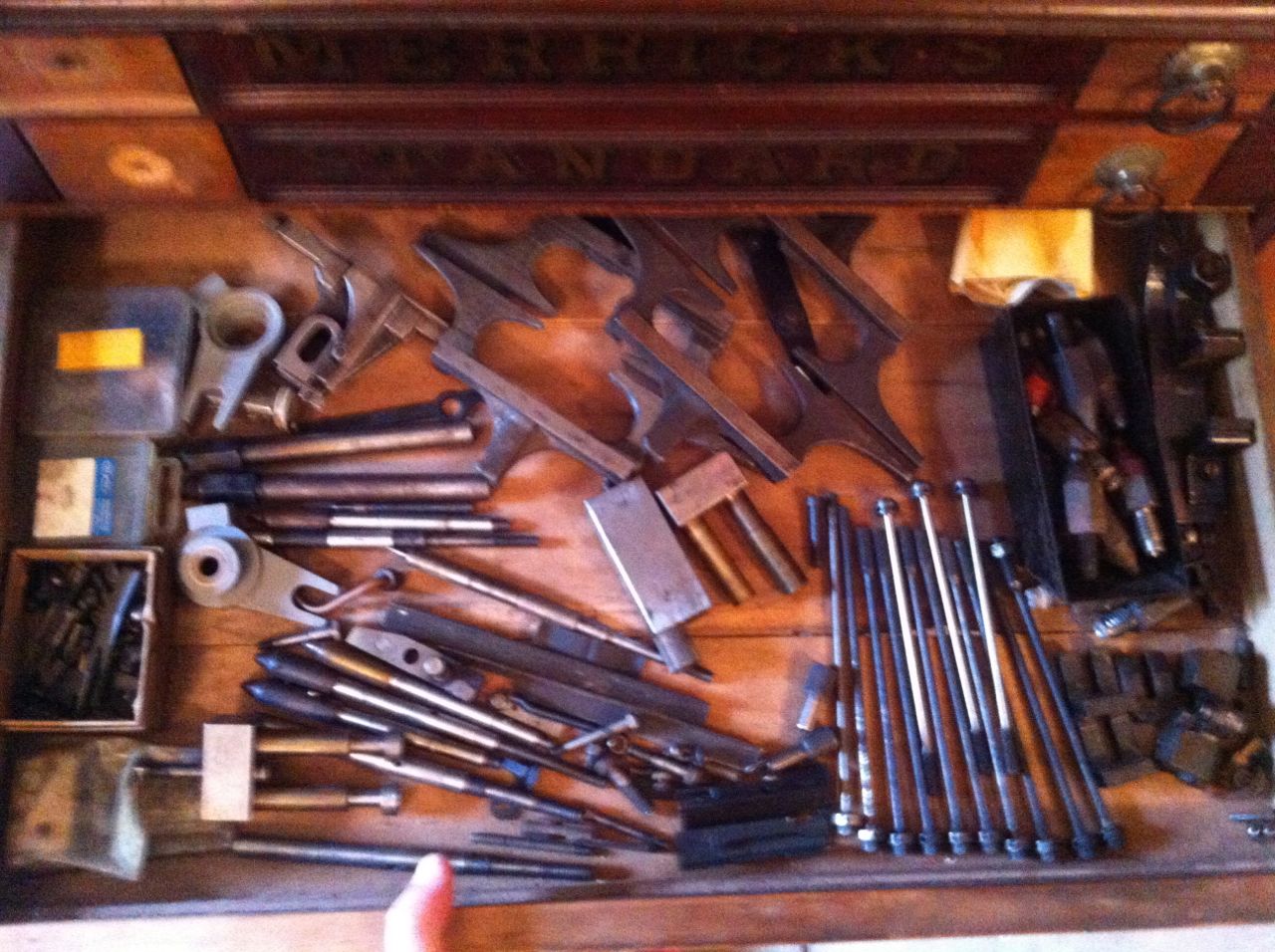
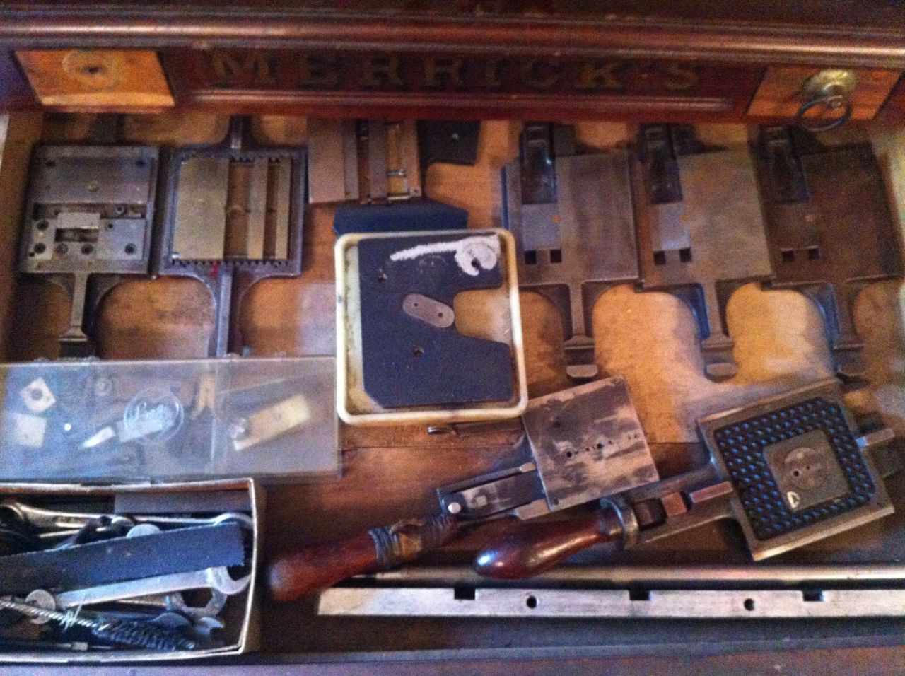
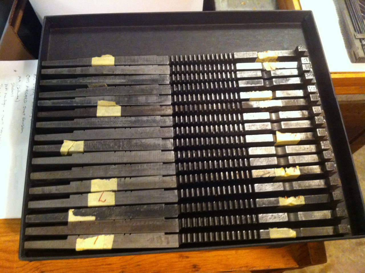
I purchased this particular font of mats from Rich Hopkins or Hill & Dale Press & Typefoundy when visiting as a student and Monotype University 5. The dirty old box has a typed paper label which reads “The Kitsilano Times’. I have yet to identify this former, probably newspaper, publisher.
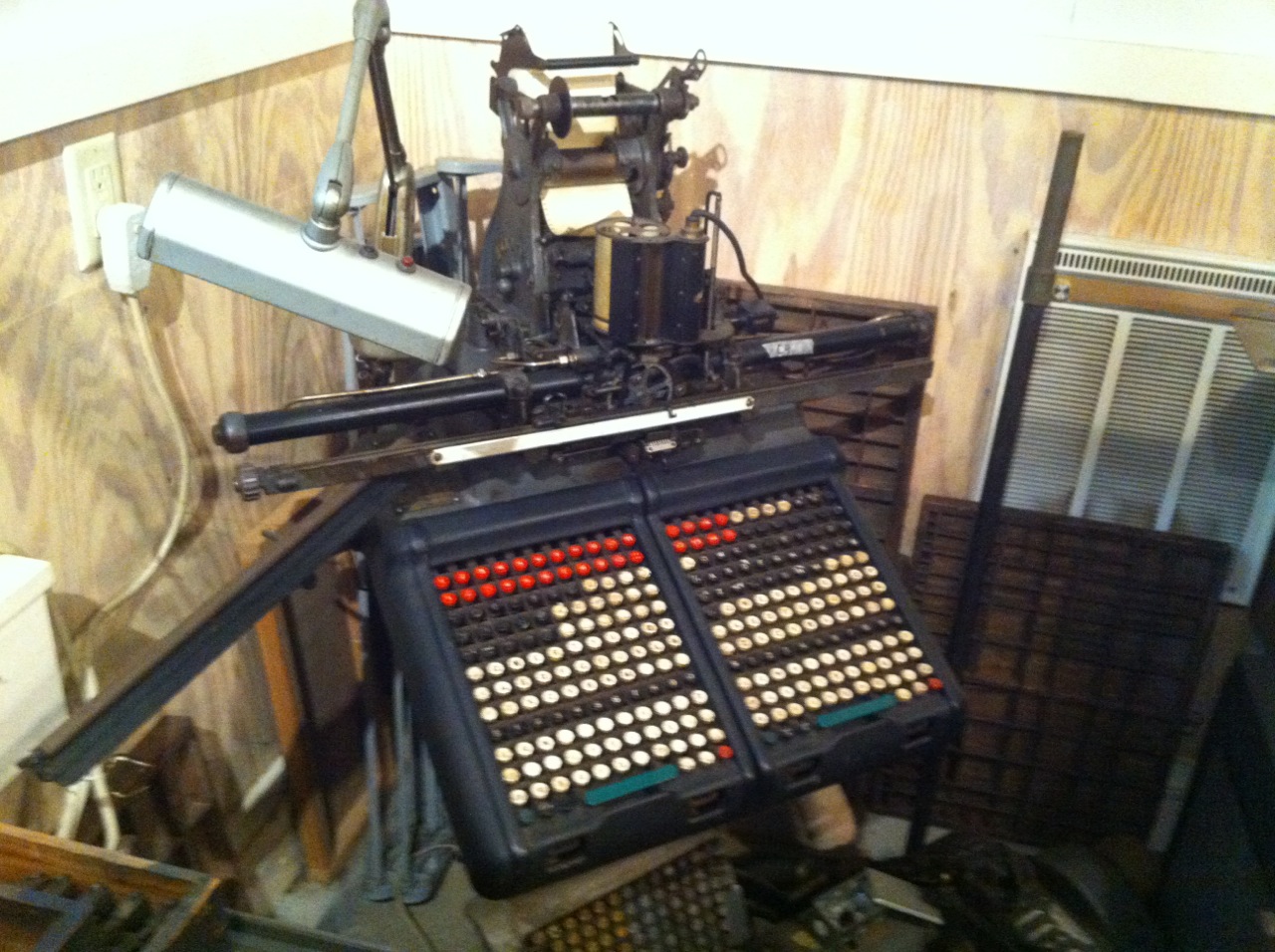
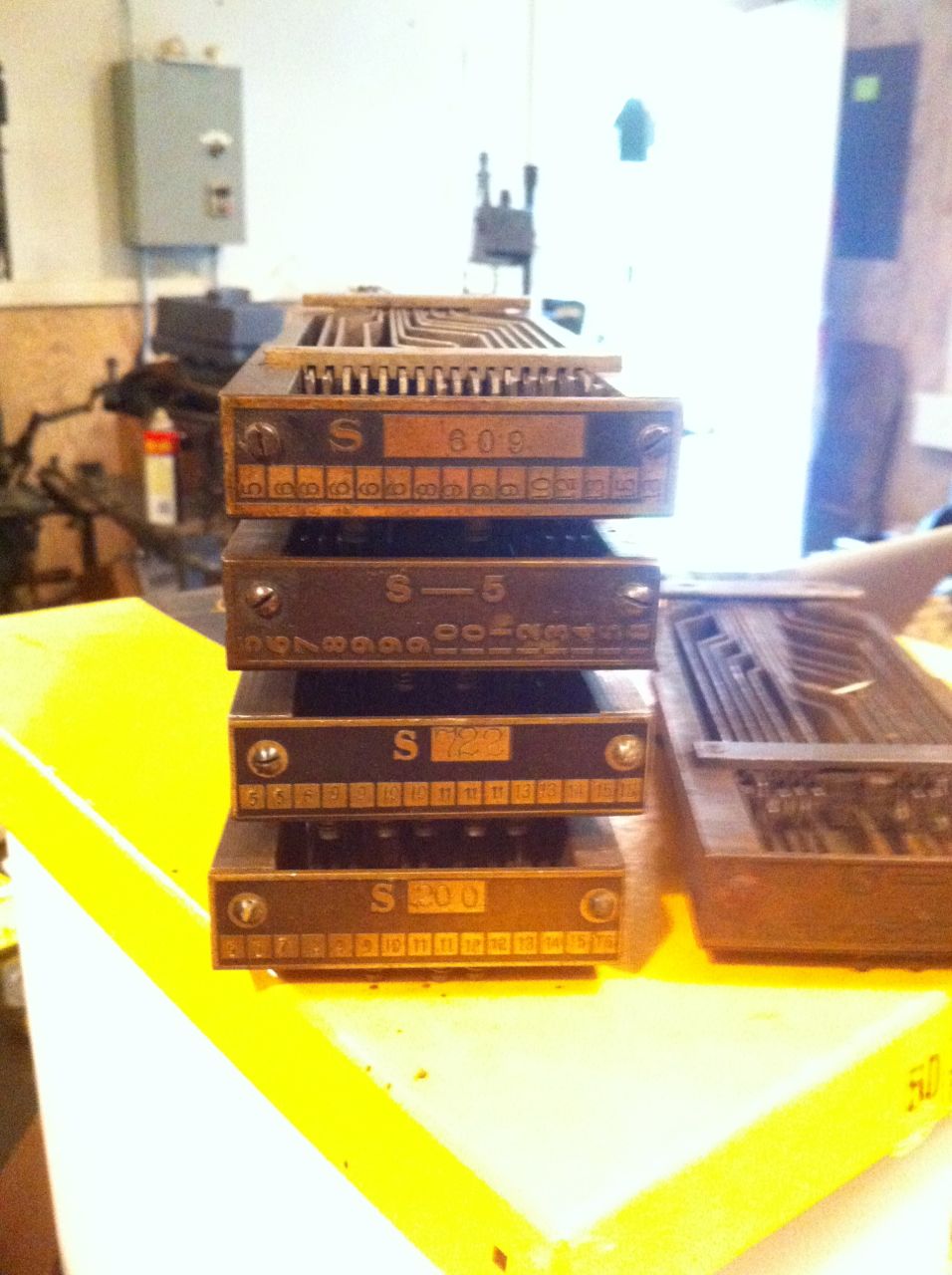
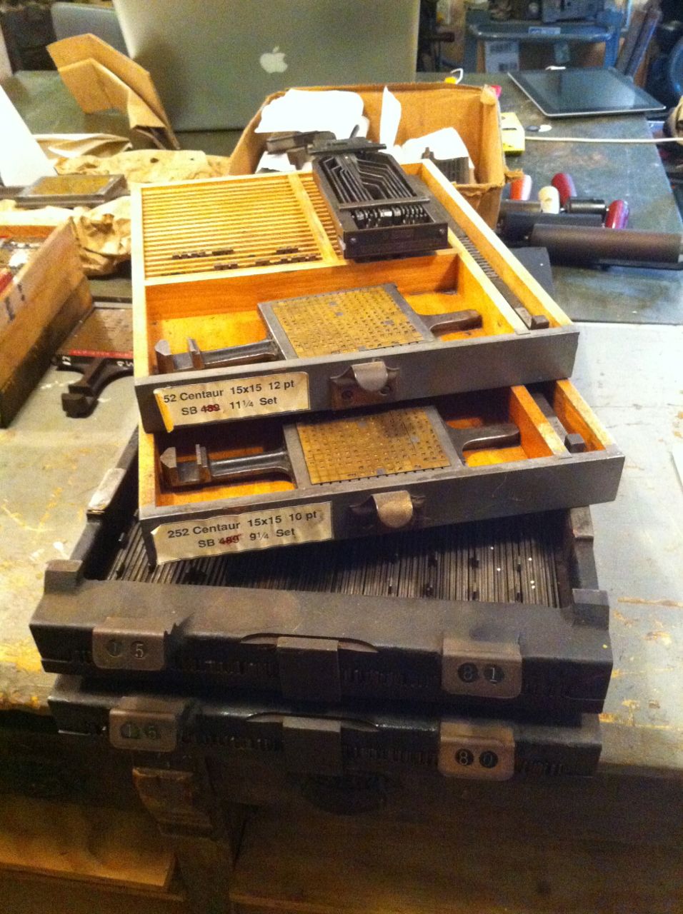
Each Lanston Monotype display matrix shows four numbers on the front of the mat. These are 1) the Monotype Series Number, which identifies the typeface (in this case, No 144 is Bold Antique); 2) the point size; 3) the normal wedge position; 4) and the special justification wedge position. Together, the positions of the two wedges determine the width of the type body setwise, that is, parallel to the reading direction. The table below shows the wedge positions and resulting character widths for each character of 14pt Bold Antique. When casting display type, it is customary and wise to cast all characters of a given width in sequence, then move on to the next widest character. Not only does this approach ensure consistency and precision, is also provides the most efficient process simply because it incurs the fewest adjustments of the caster.
| Bold Antique |
Series No. 144 |
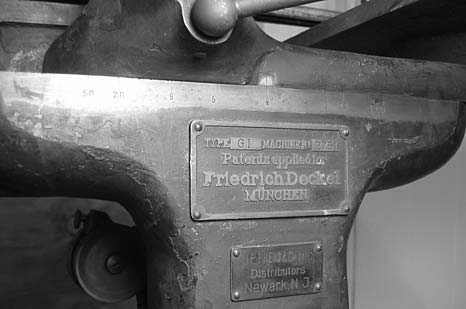
| Lanston Monotype Machine Company |
| Line Standard: 0.1532 inches |
| Abutment Screw Packing Piece must be in place for all sizes in this table |
| Wedge Settings |
Width2 |
Characters |
| .0075 |
.0005 |
|
|
| 4 |
4 |
.0623 |
‘ ; , . : ! |
| 5 |
4 |
.0761 |
l i |
| 6 |
2 |
.0865 |
– t |
| 6 |
4 |
.0899 |
? |
| 6 |
6 |
.0934 |
j |
| 7 |
2 |
.1003 |
f |
| 7 |
4 |
.1038 |
s I |
| 8 |
2 |
.1141 |
z |
| 8 |
4 |
.1176 |
r e c |
| 9 |
4 |
.1314 |
y v |
| 9 |
6 |
.1349 |
o |
| 9 |
8 |
.1383 |
x q p g d b a |
| 10 |
4 |
.1453 |
u n h S J |
| 10 |
6 |
.1487 |
k |
| 10 |
8 |
.1522 |
0 1 2 3 4 5 6 7 8 9 $ |
| 11 |
2 |
.1556 |
Z L |
| 11 |
4 |
.1591 |
C |
| 11 |
6 |
.1625 |
T |
| 11 |
8 |
.1660 |
E F |
| 12 |
6 |
.1764 |
V Q P O G |
| 12 |
8 |
.1798 |
Y B |
| 13 |
4 |
.1868 |
w U N D A |
| 13 |
6 |
.1902 |
X R |
| 13 |
8 |
.1937 |
H |
| 14 |
2 |
.1971 |
K |
| 14 |
8 |
.2075 |
& |
| 15 |
4 |
.2144 |
m |
| 15 |
8 |
.2213 |
M |
| 18 |
2 |
.2525 |
W |
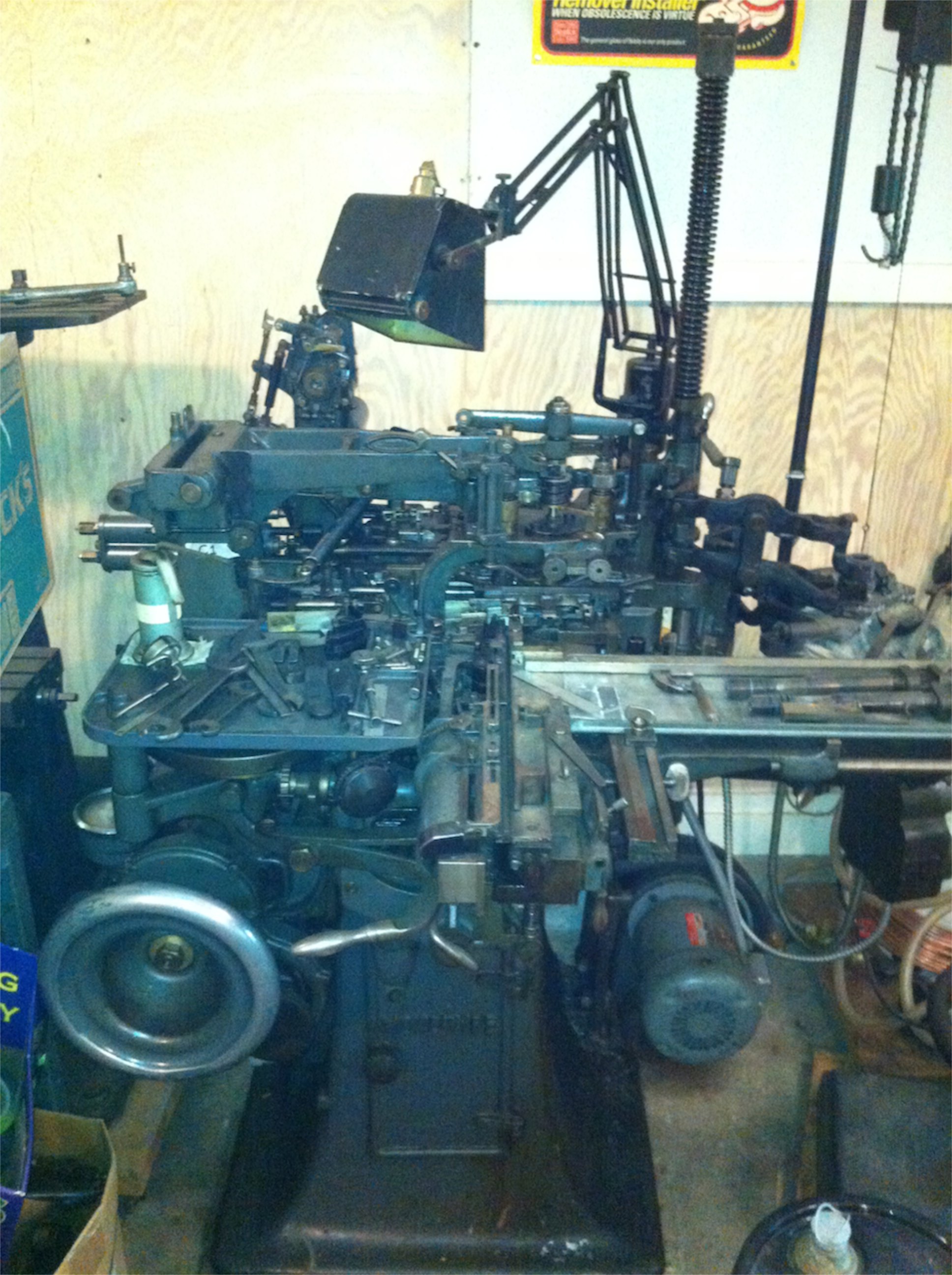
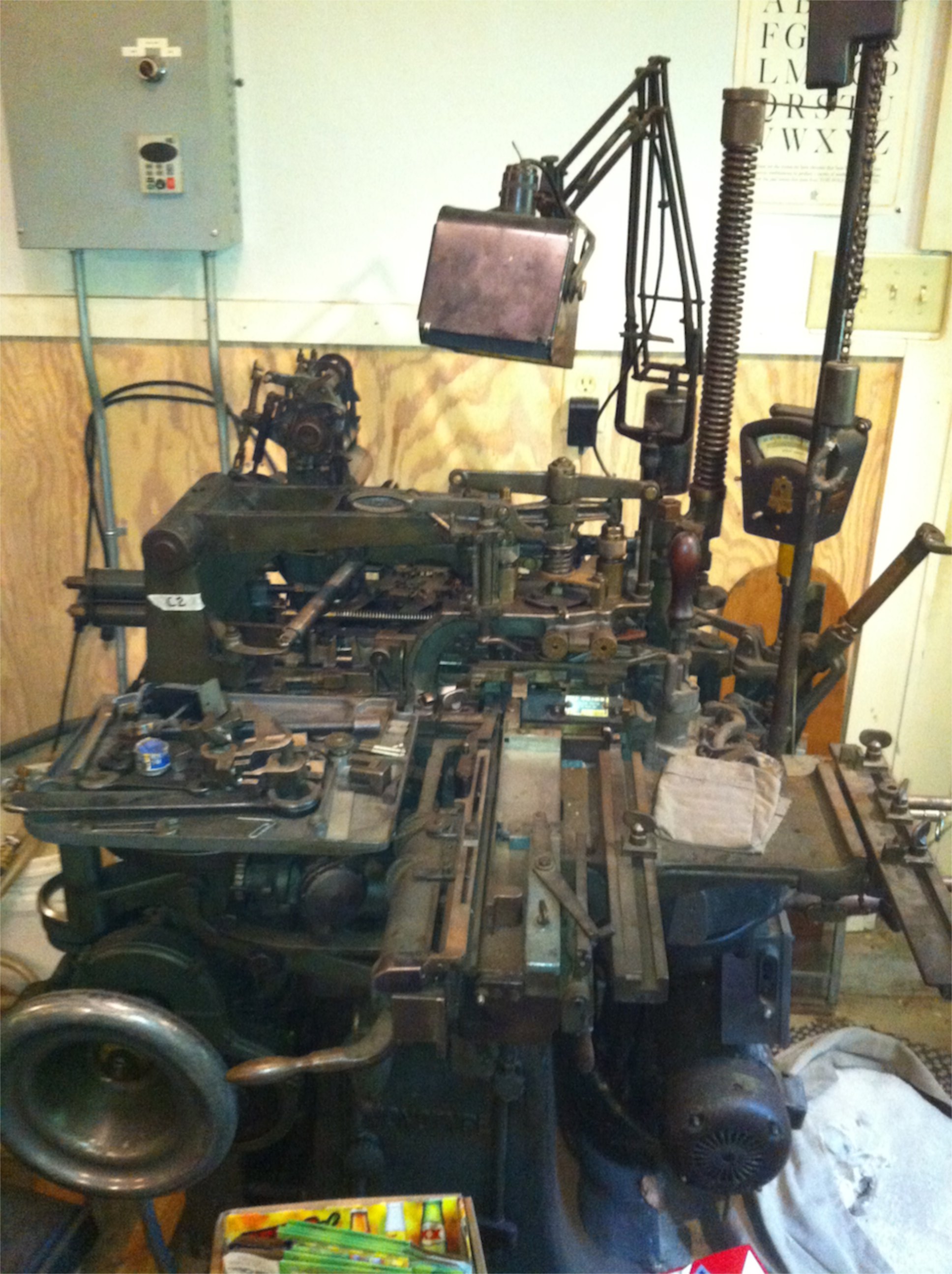
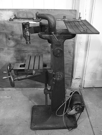
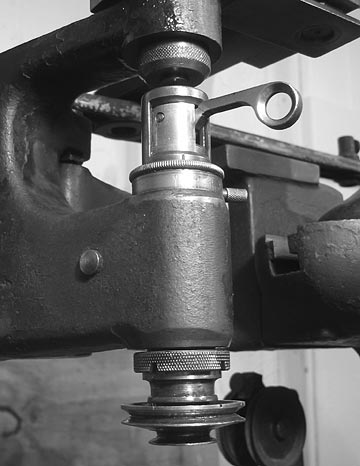
Today I continued setting up the Monotype Composition Machine for display casting. I have several sources that detail the procedure of switching a comp caster over to display work…for both British and American machines. My 1916 Lanston edition of Casting Machine Adjustments is the most illustrative and breaks the process down into discrete steps.
This is the first time I’ve converted a caster from comp to display. Having completed the process, I am left wondering how difficult it will be to switch it back. While most of the adjustments are very simple 3, adjustments to the pump where a bit trickier for me. I didn’t take notes on previous positions of a few parts, and now that they’ve been adjusted, I cannot precisely reverse those adjustments.
Cast a blank matrix in the 15-8 position. Or maybe 16-8. A wide type…consistent and fairly solid, but with a little flash around the head. I attributed this to matrix wear, but now also believe that the metal was been too hot…720°+, if my auxiliary thermometer is properly calibrated (and it is indeed suspect).
The very first type bodies looked fairly good, well-formed and solid, but they got worse as time passed, first showing small blisters on the sides near the foot. The machine was splashing a good bit and a significant build-up of solidified type metal was forming on the underside of the mould stand. I reviewed the adjustments to pump as described in Casting Machine Adjustments and the later British The Monotype Casting Machine. While fiddling with the pump adjustments I realized that I still do not have a solid understanding of the mechanics of the Monotype pump, particularly when it comes to casting display type.
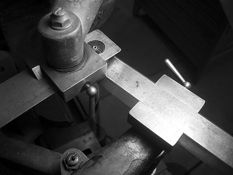
I put the cap ‘E’ mat in the holder and set the wedges to 11-8, which should result in a type measuring 0.1660 inches, setwise. After a few characters emerged with an overhang on both sides, it was obvious that I had set the wedges incorrectly. Was the gauge reading to be taken on the left edge or the right edge of the transfer wedge operating rod guide? Hmmm.
When I was sure that I has re-set the wedges correctly, I started the machine a cast a few short lines. I could see from the way the characters leaned in the type channel that there was still an overhang on the type. Indeed there was—but this time the overhang was only on one side and there appeared to be enough room on the body to accomodate the entire face and beard of the type. Good news.
From my experience at Monotype University as well as the numerous books I poured over in the last few years I’ve learned a little something about aligning the face of type to the type body. It turns out: I need a serious review! Though I managed to align the type using only the centering pin adjustments, the whole time I felt there was something else I should have adjusted first. More on that later.
Looking at this cap ‘E’ it was clear that the body was now too wide; the actual width 0.1854 inches, not 0.1660 that the 11-8 wedge setting should provide. Could I have set the wedges incorrectly again? As yet, I have not answered this question. In my next trip out to the foundry, I hope to resolve the 0.0194 inch difference in the set width. Something simple.
One final measurement gives some idea of the age and wear of both the type mould and the matrices with which I am casting. The height of the type, or height-to-paper, is a mere 0.9165+/-0.0005! Nominally “type-high” is 0.918 inches. More precisely, the standard is 0.9186 inches4.
References
1. McGrew, Mac. American Metal Typefaces of the Twentieth Century, 2ed., pp 44, 1993, Oak Knoll, New Castle DE.
2. Widths derived from “Display type wedge positioning” in ‘Monotype’ Composition Caster Manual, Volume 2, Part 37, Table 37.4, 1970, The National Committee of Monotype Users’ Associations with The Monotype Corporation Limited, London.
3 e.g. swinging the display gag block into position so that the centering pin lever picks up the transfer wedge shifter up on every cycle of the machine…only type is cast…no spaces.
4From the glossary entry for “height-to-paper” in The Monotype System, Lanston Monotype Machine Company, 1916 Philadelphia.